Rhode Island
Spine Center
Rhode Island Spine Center is Dr. Donald Murphy's chiropractic spine-care clinic in Cranston, RI. Brightwork designed and built its patient website — warm, clear and built to convert — choosing the final look from nine full design directions, and shipping real clinical tools alongside it, with a team of AI agents.

Rhode Island Spine Center is Dr. Donald Murphy's chiropractic spine-care clinic in Cranston, RI. Brightwork designed and built its patient website — warm, clear, and built to convert — choosing the final look from nine full design directions, and shipping real clinical tools alongside it. Warm and reassuring on the surface, carefully engineered underneath, and mobile-first throughout.
The patient's side of the practice
Rhode Island Spine Center is a working spine clinic whose message is direct and human: "Overcome pain. Return to your life." — "We find the cause. You get your life back." — "You've been told to 'just live with it.' We disagree." The audience here is patients: local, often in pain, deciding whether to book. So the site had to feel warm and trustworthy, not clinical or corporate.
This is one door of two. Dr. Murphy also has a professional / consulting brand — his own expert site for referring physicians, lawyers and administrators — with its own case study. One clinician, two brands. This is the patient door; the other is Dr. Donald Murphy. We designed them to be deliberately opposite: warm teal reassurance for patients here, navy authority for professionals there.
You've been told to "just live with it." We disagree. We find the cause — and you get your life back.
— the clinic's promise, in a line
Mobile-first from the brief
Most patients meet the clinic on a phone, so the whole site was designed for the small screen first — the same warm teal hero, the same clear promise, the same booking path, on the device most people actually hold.

Nine directions, one decision
Rather than guess at a look — or argue about it in the abstract — Brightwork built nine complete, independent design directions, each as its own Astro project with the real clinic content inside it. Not mockups: full, working sites, all previewed live so the client could compare real things side by side before promoting a winner.
Explained plainly, this is design-in-production A/B testing: the client chose from live, browsable sites rather than flat comps. The teal "MD" medical identity won decisively — Design 3 was promoted first, then iterated forward into the final Design 9 now live. The alternates were then cleanly retired; they survive only in git history, which is why we show them here as palettes rather than fabricated screenshots.
Dark, high-contrast — an electric-mint edge on black & white.
Clean medical teal, big rounded cards.
Warm coral marketing energy.
Traditional teal-to-blue, serif type.
Modern navy SaaS glassmorphism, amber pop.
Organic spa — sage, terracotta, cream.
The teal identity, rebuilt on Tailwind v4.
The teal identity — final, shipped, now live.
Eight of the nine design directions Brightwork built and previewed live (design 01 was the first baseline pass). Each was a full, working site — the client picked from real things, not mockups.
◇ For engineers Nine parallel Astro builds, promoted then torn down
Each direction was a separate Astro build
configured with its own base: '/designN' and
compiled into public/designN/, so every alternate
shipped as a set of static files the client could browse live —
nine real websites at nine URLs, not nine slide decks.
Once the teal identity won, its build was
promoted into the root src/ as the
principal site, and the eight alternates were
cleanly torn down. Nothing lingered in the
shipped bundle — the retired directions live on only in git
history, which is the honest reason this chapter renders them as
palettes rather than screenshots.
The winning system: calm, clinical, warm
The direction that won is airy and medical: a warm
teal (bright #00A8BC, deep
#08363B, light #EDF9FC), self-hosted
Urbanist + Mulish type, big
30px rounded cards that lift on hover, a fluid
clamp() type scale, dark-teal CTA bands, and a CSS-only
"spine" scroll-progress indicator that ticks down the page like
vertebrae.
It's worth contrasting this with Dr. Murphy's professional site deliberately: same clinician, opposite register — navy authority for lawyers and administrators there, warm teal reassurance for patients here. That isn't inconsistency, it's audience design: each brand is tuned to the people it needs to convince.

◇ For engineers Self-hosted fonts, WCAG-tuned links, and a scroll-timeline spine
Type is self-hosted as subset woff2, preloaded
with font-display: swap — no render-blocking Google
Fonts round-trip, so the warm headline lands fast and shifts
nothing when the webfont arrives.
For accessibility the link colour is darkened from the brand
#00A8BC to #007D8E so text hits
WCAG AA contrast against the light teal
backgrounds — the brand teal stays for surfaces, a compliant
teal carries the text.
The "spine" progress indicator is
CSS-only, driven by
animation-timeline: scroll(): the vertebra marker
advances as you read, with zero JavaScript on the critical path.
The patient journey, made simple
The hard part of a clinic site isn't decoration — it's turning a clinical method into something a person in pain can follow. Brightwork built the journey around a single promise ("your spine pain has a cause") and four plain steps: find the source → treat it, precisely → self-care from day one → you take over. The positioning is deliberately anti-fluff and pro-independence: "our goal is to make sure you don't need us long-term."
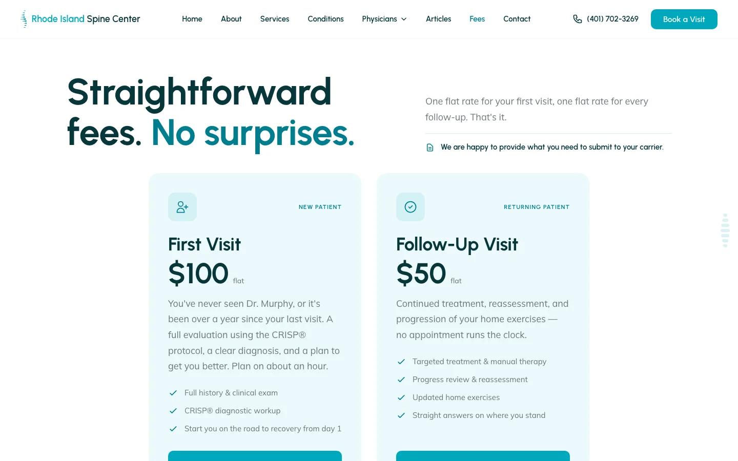
From there, the site names the 8 conditions the clinic treats — each with its own specific cause — and states the fees with radical clarity: a flat $100 first visit and $50 follow-up, out-of-network, with online booking through JaneApp. No coded pricing, no surprises.
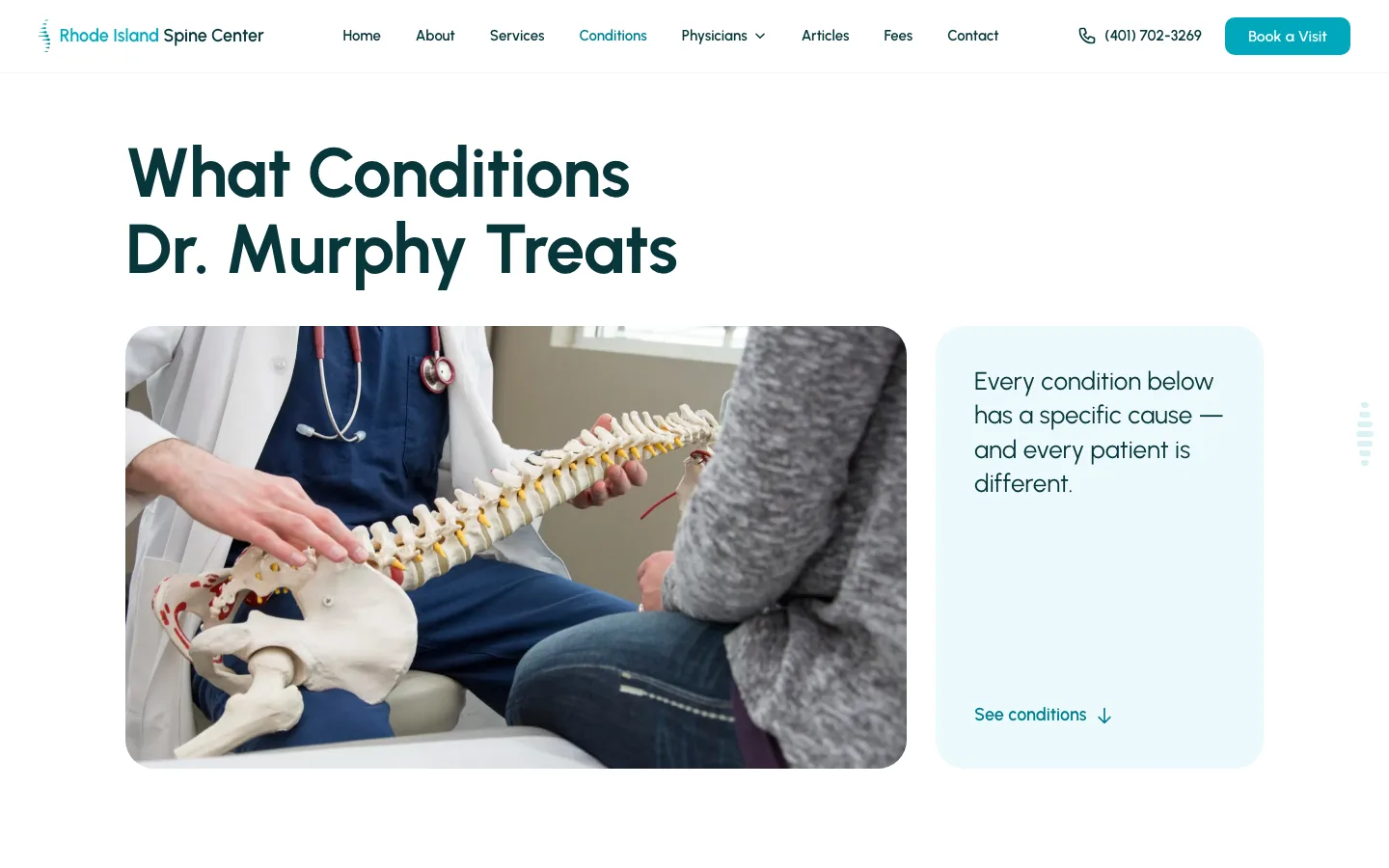

Left: the conditions overview — every condition traced to a cause. Right: the condition cards, where the Spinal Stenosis card cites Dr. Murphy's own studies ("In fact, I helped do those studies").


Real tools for real clinic work
A clinic website isn't only brochure pages. Brightwork built working
clinical tooling into the site — most notably an
exercise-handout printer:
44 exercises across 8 categories, each a
token-templated prescription a clinician fills in
({reps} / {times-per-day}) and
prints for the patient to take home — plus a
CRISP® self-assessment wizard that guides patients
through their own picture before they ever walk in.
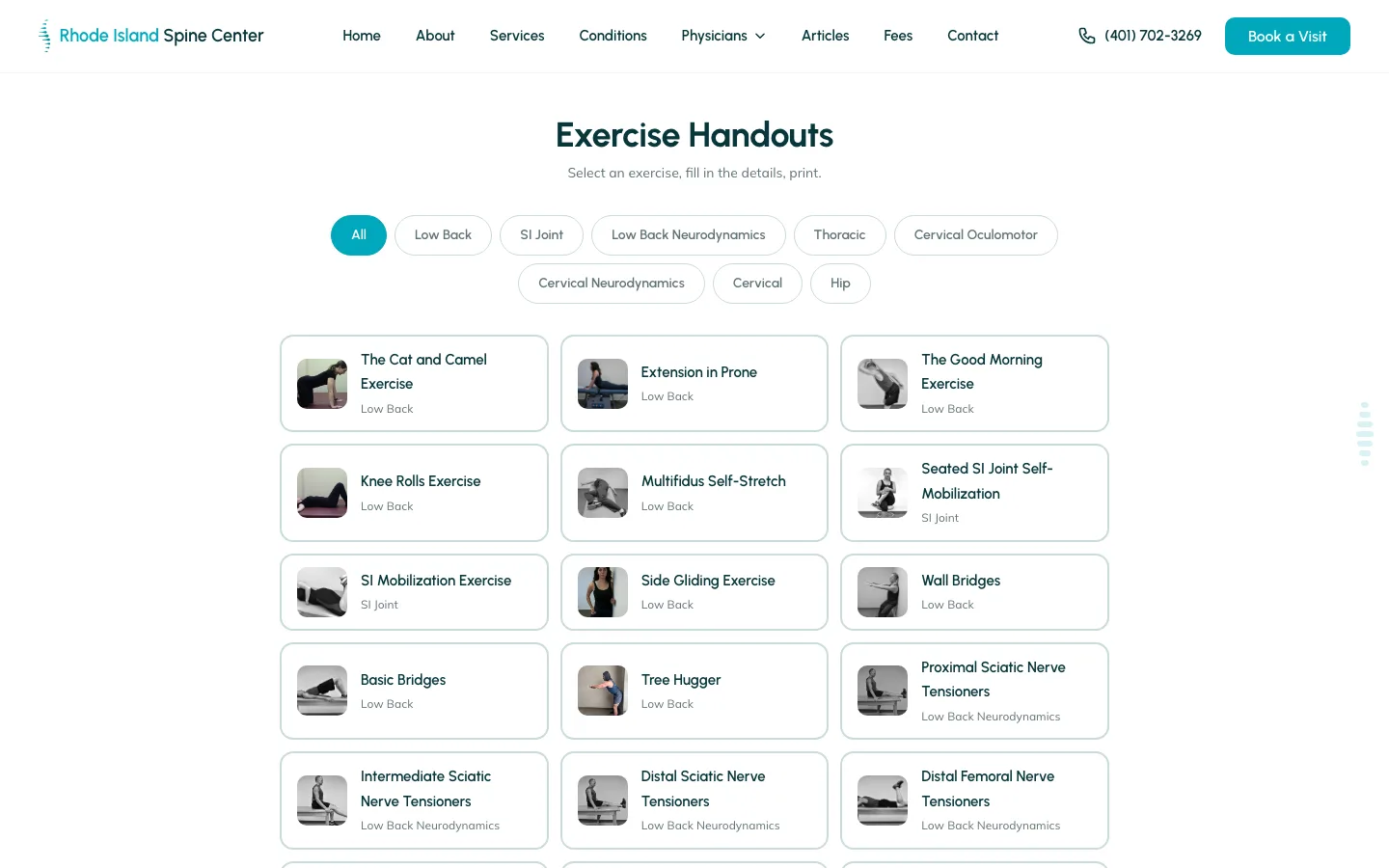
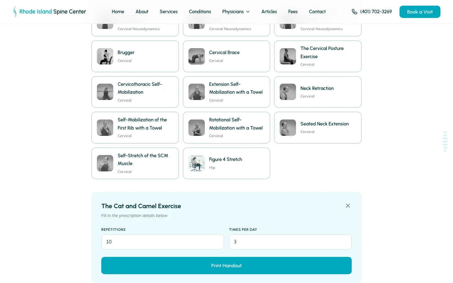
Left: 44 exercises filtered by 8 categories. Right: the prescription composer — a clinician sets reps and times-per-day, then prints a handout the patient carries out the door.
◇ For engineers The iOS print problem, and a Puppeteer PDF fallback
The obvious way to print a handout is the browser's own print dialog — but iOS Safari ignores CSS print page-size, so a clinician printing from an iPad would get a mangled layout. Rather than accept that, the Print button falls back to a server-side Puppeteer / headless-Chromium PDF endpoint: the same handout is rendered to a letter-perfect PDF on the server, so it prints identically on any device.
The prescription itself is
token-templated: the handout copy carries
{reps} and {times-per-day}
placeholders the composer fills from the clinician's input, and the
category filter is a simple client-side match over the exercise
set's category field — 44 exercises, 8 categories, one
fast filter.
A funnel for referring physicians
The clinic doesn't only serve patients — it courts the primary-care physicians who send them. So Brightwork built a whole /why-refer subsite: the "Primary Spine Practitioner" case laid out against PT, physiatry and surgery and backed by Dr. Murphy's own peer-reviewed papers, an embedded Dr. Murphy intro video for PCPs, a dedicated physician "Back Line" phone number, and a printable one-page referral handout.
This is the professional bridge back toward Dr. Murphy's expert brand — the natural handoff from patient clinic to consulting reputation. It is, fittingly, where the two case studies meet: the referral funnel here leads to the same clinician profiled in the Dr. Donald Murphy case study.

What's underneath
Under the warm surface, the clinic is a fully static
Astro site (upgraded across major versions
5 → 6 → 7) on Vercel, styled with
Tailwind v4's CSS-first @theme tokens.
It ships hand-authored <picture> WebP,
Chiropractor (LocalBusiness) + FAQPage + Article
schema, an llms.txt for answer engines, self-hosted
fonts, and JS-classified scroll-reveal.
◇ For engineers A View-Transitions flash — an honest postmortem
Not every round was clean, and it's worth being candid about it. For several iterations the site carried a navigation flash when Astro View Transitions swapped pages — a brief flicker of blank content mid-transition.
The root cause was a
FOUC from the scroll-reveal setup: elements start
at .reveal { opacity: 0 } and are revealed by
script on scroll, but across a view transition the incoming DOM
briefly rendered those elements still at
opacity: 0 before the reveal script re-ran — so the
new page flashed empty. Fixing it took real iteration: reconciling
the reveal lifecycle with the view-transition lifecycle so the
incoming page paints its content immediately. It's the kind of bug
that only shows up in production, and it's documented here rather
than hidden.
◇ For engineers Astro 5→6→7, Tailwind v4, and structured data
The site was carried across three Astro majors
(5 → 6 → 7) over the life of the build — staying current rather
than pinning to a version that would rot — and moved to
Tailwind v4's CSS-first @theme
approach, where the design tokens live in CSS instead of a
JavaScript config.
For discoverability it emits
JSON-LD as Chiropractor
(a LocalBusiness subtype) plus FAQPage and
Article schema, and ships an
llms.txt so answer engines can read the practice
directly. Images are hand-authored <picture>
WebP rather than left to a black-box optimizer.
Built by a team of AI agents
Rhode Island Spine Center was built the way Brightwork builds everything — with a coordinated team of AI agents, orchestrated by Loom on GitHub. Every client request became an issue, built by an isolated shepherd agent in its own git worktree, reviewed as a pull request, and merged when clean. Over roughly five months that added up to about 322 commits, with parallelism deliberately capped at two to three agents at a time.
The assembly line
A task is filed on GitHub — a feature, a fix, an idea.
An agent enriches it into a clear, buildable spec.
A builder agent implements it in an isolated worktree, opens a PR.
A judge agent reviews the PR for quality and safety.
A champion agent merges it — and the change ships.
Later work on the clinic was client-feedback-driven: a real iterate-with-the-client loop layered on top of the AI orchestration, so the client's own notes turned into shipped changes. The result is fast, parallel and — crucially — auditable: every decision lives in a pull request you can still read. And in the same spirit, this very case study was built the same way, as a tracked GitHub issue run through a Loom cycle.
◇ For engineers The Loom role model
Loom coordinates agents through GitHub as the shared source of
truth, with one git worktree per issue (branch
feature/issue-N) so agents work in parallel without
colliding. Labels drive the state machine
(loom:issue → loom:building →
loom:review-requested → loom:pr), and
parallelism is capped at two to three agents at a
time. The roles:
- Curator enriches a raw idea into a spec-ready issue
- Builder implements it in an isolated git worktree, opens a PR
- Judge reviews the PR for quality, security & correctness
- Champion auto-merges once it is clean and mergeable
- Hermit hunts down complexity and proposes removing it
Governance is deliberate: a capped number of parallel agents, no unattended daemon, and auto-merge restricted to pull requests GitHub reports as genuinely mergeable and clean.
The result
Rhode Island Spine Center is live at rhodeislandspinecenter.com: a warm, fast, high-converting clinic site — chosen from nine design directions — with real clinical tooling and a physician-referral funnel, all mobile-first and shipped by AI agents. A patient clinic built end to end, and one half of a two-brand story.
Nine full design directions built and previewed live — one warm teal identity chosen and shipped.
An exercise-handout printer (44 exercises, 8 categories) with a Puppeteer PDF fallback, plus JaneApp booking.
~322 commits by AI agents on Astro 7 + Tailwind v4, with client feedback turning into live changes.
What we built
- Nine design directions → one full working sites for live client review, not mockups
- Warm teal identity airy medical teal, deep-teal CTA bands, 30px rounded cards
- Self-hosted type Urbanist + Mulish, subset woff2, no render-blocking fonts
- Mobile-first the whole clinic designed for the phone first
- Four-step method find the source → treat → self-care → you take over
- 8 conditions each with a specific cause, patient-legible
- Transparent flat fees $100 first visit, $50 follow-up, no surprises
- Online booking JaneApp scheduling, one clear “Book a Visit” door
- Exercise-handout printer 44 exercises across 8 categories, token-templated
- Print / PDF fallback server-side Puppeteer so iOS prints letter-perfect
- CRISP® self-assessment a guided patient wizard
- Prescription composer {reps} / {times-per-day} filled in and printed
- Chiropractor + FAQPage schema structured data for search & answer engines
- Physician-referral subsite the /why-refer funnel, Back Line, one-pager
- Accessibility semantic headings, alt text, keyboard-navigable
- Loom + GitHub AI agents building through issues & pull requests
A note on trust: the real patient testimonials on the site are shown initials-only, with an "individual results may vary" disclaimer. We kept that framing deliberately — no invented patient counts, no star ratings, no named quotes.
The other half of the story
 Sibling case study The other half of the story — Dr. Murphy's professional brand One clinician, two brands. This is the warm patient clinic; that is the navy-and-gold professional site for physicians, lawyers and administrators. See how the same person gets two deliberately opposite design systems.
View the Dr. Donald Murphy case study
Sibling case study The other half of the story — Dr. Murphy's professional brand One clinician, two brands. This is the warm patient clinic; that is the navy-and-gold professional site for physicians, lawyers and administrators. See how the same person gets two deliberately opposite design systems.
View the Dr. Donald Murphy case study
This is what Brightwork does for clinic clients: a warm brand patients trust, real tools that do clinic work, and a build fast enough to turn your feedback into live changes.
Visit the live site